preloader

Virtual Campus

A user-tested prototype of a mobile app that transforms the online classroom experience from the typical video chat to an immersive virtual compass that promotes interaction and collaboration, and spontaneous meeting and socializing.

Task

Learning the methods and strategies of utilizing User Experience strategies in the design of a software project from ideation.

  • Design

    UX/UI design

  • Client

    Academic - UofT

  • Tools

    Figma, Adobe Premiere, Tripetto

  • Team

    Dionysus Cho, Amy Peng, Oliver Daniel, Omri Daniel, Parsa Tajik, Bamdad Sahraei

Step 01

Gathering Data.

We were interested in discovering the effects of remote education on a student’s/professor’s well-being. We started with this broad problem space, without trying to restrict further without further data.

 In order to better define the problem space, we are employing several techniques to gather data: interviews, surveys, and observations. Using a diverge-converge method of design, a smaller subset of our group – Amy and I – developed a questionnaire using the Tripetto platform.

Having formulated a set of roughly 30 questions, we whittled down the questionnaire to a more manageable ~7 minutes length. We then translated our survey to Tripetto, which allowed us to organize and visualize the sequence of the survey.

 With this web app, we were able to conduct eight pilot tests amongst fellow classmates via video call. The participant would share their screen as they went through the questionnaire, talking through and critiquing as they went. 

This allowed us to refine our question set with feedback after each test – “too many questions“, “the wording for this question is too vague“, “I like the emoticons!“, or “the progress bar is demotivating“.


This was an incredibly useful step in refining our own research instrument, and we continue to edit and tweak the survey before we initiate a public test.

Step 02

Analyzing Data.

Having distributed the survey amongst students through the “pass it on” method, we received 35 responses from students (33) and professors (2). 

As CS students from the University of Toronto, 50% of respondents were also CS students, and 60% were UofT students. 61% of students are currently taking 5 courses, with a 18% taking 4 and 18% taking 6 or 7 courses.

There was a clear sentiment that, given the pandemic and abrupt shift to remote learning, there was a self-perceived “worsening” of mental health. While the “level of stress” remained level, the majority of respondents tended towards feeling “slightly worse” than before.

Questions in regards to the importance of attending lecture gave us insight on what elements of a lecture that students cared about. Participation marks were clearly not a major issue for most students, but the top three were: “learning new material”, “spending time with friends”, and “meeting new people”. A growing pattern emerged – the social aspect of the lecture was just as important as the material.

 When steering the discussion towards the lecture platforms (be it any of the handful of different apps – Zoom, Blackboard Collaborate, etc.), the pattern continued. While we had initially wondered if the features or the UI of the multitude of apps could be posing a barrier to students and educators, the main source of dissatisfaction was not towards any of the platforms specifically, but that it was “hard to connect” with others.

The respondents were not so critical of the “education” part of remote education, but the “remote” aspect has clearly effected the social nature of learning.

Anonymous Respondent

I also miss seeing people. I miss seeing friends or meeting new people in my courses, being forced to actively listen and take notes, ... and talking to the professor before or after class casually

Step 03

A Design Charrette.

 With each of the three pairs in our group of six having collected our sets of data and analysis, we came back together as a team.


Having been a part of and ran numerous design charrettes and other collaborative sessions in my past life as a designer, I laid out the framework and organized this design session. Given that we had limited time and unlimited workloads, I erred on the fast and dirty approach to nail down our idea.

Charrette Plan

  • Define the Problem Space
  • Define the Audience
  • Lightning Design Rounds (3x 5min design rounds)
  • Presentations (3x (6x 1min presentation + 4min discussion))
  • Ideas Discussion (10min)
  • Top 3 Vote (5min)
  • Pair Design (10min)
  • Presentations and discussion (3x 5min)
  • Final Vote (5min)
Step 03A

Problem Space & Audience

We brainstormed a series of keywords and ideas to hone in on our Problem Space. This was based on the data we had all gathered and discussed, and we came away with a clear set of possible problems to tackle.

  • social engagement and interactions
  • accessibility and organization of education material
  • promoting personal time and de-stressing
  • mental health awareness

Our Audience had not changed from our initial meetings. Since we were tackling “education”, the key users would be students and educators.

Step 03B

Lightning Design Rounds

These design rounds were FAST

6 people.
3 rounds.
5 minutes to jot down an idea then abandon that thought and start a new one. This was an effort to generate quantity and variety. It’s also a fun exercise (or at least I think so!).

Group ideation in Figma.
Step 03C

Ideas & Discussions

 After each round, we had a brief discussion period. 

After all the rounds and discussions, we began to organize and filter ideas into similar categories – grouping and trimming as necessary.

 We narrowed it down to several groups, and a scattering of individual ideas. Then, the first round of voting selected the top three ideas of:

  • virtual campus: a physical sense of space in virtual gatherings
  • digital organizer: making a collaborative and accessible lecture platform
  • video redesign: adding features to and augmenting existing platforms
Grouping and organizing similar ideas.
Step 03D

The Final Vote

After a final series of discussions, we had a final vote.

Although we were divided on ideas, of which we had many, we came down to one main design idea that would start to tackle the issues our data had unveiled:

Providing a physical sense of space to the virtual experience of remote lectures - enhancing social engagement and promoting spontaneous interactions between students and professors alike.

Quick mockup of possible campus interpretation.
Step 04

Low Fidelity Prototypes.

The next step of the design process involved developing lofi prototypes of our design concept, followed by a gauntlet of usability tests.

For this prototype, I focused on three key aspects for a virtual campus: transitioning from space to space, accessing course materials, and participating in clusters. First, the development of a Hierarchical Task Analysis revealed some of the user goals and subsequent tasks the app would need to develop to provide this.

A hierarchical task analysis for online lectures.

At this point, we had already developed experience maps, personas, and scenarios to inform our conceptual design and to craft usability studies. Here is the scenario that I presented the users for testing:

You are a 3rd year computer science student, and have been using other tools (like Discord and Messenger) to chat and discuss content with your classmates during class, and you have tabs open for Quercus, Piazza, and more – but now there is an app that integrates social communication and lecture materials into one package.

4. LoFi Prototype

Campus to Classroom

My vision for this was to create a minimal and user-friendly means to represent the campus. I did not want to have a realistic depiction or a 1-to-1 map representation – this would introduce an unnecessary clutter of buildings that did not have to be reflected in the virtual campus.

Instead, I would simplify these to departments or programs, and have representative buildings – for example, I list Computer Science programs under CS / Bahen. Having additional buildings would increase fragmentation of the userbase (eg. some CS classes in Bahen, some classes in Myhal, etc).

4. LoFi Prototype

Class Materials

This part of the design was quite straightforward – I wanted to integrate some elements currently hosted on Quercus (the current UofT web platform) with the “classroom”. 

While inside the lecture, one could navigate through course material by selecting the contextual hamburger menu. This would act as a repository for materials including past lectures – where users could re-play past classes – and supporting media files.

4. LoFi Prototype

Classroom Clusters

The concept of Clusters is what I would consider one of the key elements for this proposal. 

Before joining a cluster, users are given some details from the classroom view – the profile photo or live video avatars, and mood tags to give a quick view of a cluster’s sentiment. Moving the user’s avatar towards a cluster will then pop up a preview, which provides some basic statistics (number of users, privacy settings, friends count) as well as the means to join.

The classroom view highlights the integration of the video lecture (“Lecture Slides” portion at the top of the screen), and the floating clusters of users. Like a physical classroom, we are focusing on closeness and proximity of users, rather than creating facsimiles of lecture rooms (eg. seating, rooms, windows, etc…). 

This puts attention on what’s important: social connections and lecture materials.

Joining Clusters in the Classroom view.
4. LoFi Prototype

Clusters & Action Bar

The action bar at the bottom is one element I would continue throughout the experience – it would act as a constant throughout the experience to make it cohesive. 

On the left is the user’s mood, on the right is the contextual menu hamburger, and the middle activates chat features. This would be useful through the app, so should appear in all views. The action bar should be further iterated to enhance this feature.

Action Bar: setting Mood and text input.

 Within a cluster, chats are private to the group (they do not spam the professor’s chat). This allows for in-group discussion of lecture materials, and allows classmates to answer each other’s questions or collaborate on some aspects of the lecture. 

By removing unnecessary messages from spamming other users, this allows for more intimate conversations (instead of the usual 300 user chat), and also reduces professor distraction. This is not meant to isolate the cluster from the classroom, as messages can be promoted outside of the classroom.

Promoting private chats.

This was well received, though one user was not familiar with this convention, and mentioned interacting with the professor’s avatar.

While I would not use this for “reactions”, the professor’s avatar should be thought through further, allowing for some unique interaction.

Step 05

Usability Testing

After running Usability Tests on my prototype, I was able to collect some insights on how to improve the layouts. This included tracking observed user actions (as compared to what I had expected), and quick notes on their thoughts during the process.


With these comments in mind, I made some quick fixes to prototype to better the design.

With these comments in mind, I made some quick fixes to prototype to better the design.

For example, insightful user comments on the Classroom view led to a series of adjustments for better clarity and user navigation.

Usability Test Observations

  • 1 of 4 user wanted to click on the teacher icon
  • 2 of 4 users could not identify the hamburger
  • users noted the mood icons
  • users liked being able to see cluster details
    • TA’s, mood, size, profile
Before After

 Updated Design

  • Move “Classroom” name to top to match nav views for consistency
  • Added back button to leave, to facilitate view navigation and consistency
  • Add “crowns” to Prof/TAs and TA count for easy ID of educators
  • Give Prof/TA unique color ring to further separate from students
  • Added TA count for user clarity
  • Added additional “Mood” emoji to Clusters to improve cluster preview
  • Added “general” chat preview to appear above Action Bar to guide users to conversation.
  • Action Bar separates Mood / Chat / Menu for increased clarity
Step 06

Cognitive Walkthrough

With the presentation of our work and documentation of the updates from the usability tests completed, the next step included performing cognitive walkthroughs of the prototype and determining areas which needed updating via heuristic assessments. 

It was determined that this key screen (that of the campus navigation), had several confusing elements that needed remedying.

 The first update involved answering some questions that arose. For this updated lo-fi prototype, I opted to convert the hand drawn elements into Figma shapes. This allowed for a little more flexibility in modifying and testing changes.

  • What do the numbers in the bubbles mean?
    • Population. Added Icon to suggest Users.
  • What is a Plaza for?
    • Open unprogrammed space. Renamed to Cafe
  • Are the hearts friends, or likes, or favorites
    • Friends. Added Icon to suggest Friends.
  • How do we know if something is going on inside
    • Added Badges to suggest events within.
Updates from cognitive walkthrough.
Step 07

High Fidelity Prototype

In preparation for another round of usability tests, the next task was to develop hifi prototypes of the user interface. Continuing to work in Figma, I continued the theme of flat illustrations and vibrant color blocks while adding animated transitions to suggest movement. 

This involved incorporating design feedback from prior tests and ideas and suggestions from group charrettes.

This prototype features the main elements of the user experience – from login to campus navigation to class interactions. Highlighting key aspects like chat promotion within a cluster chat or accessing class materials allows the user to get a sense of and test the design’s usability.

Step 08

Final Presentation

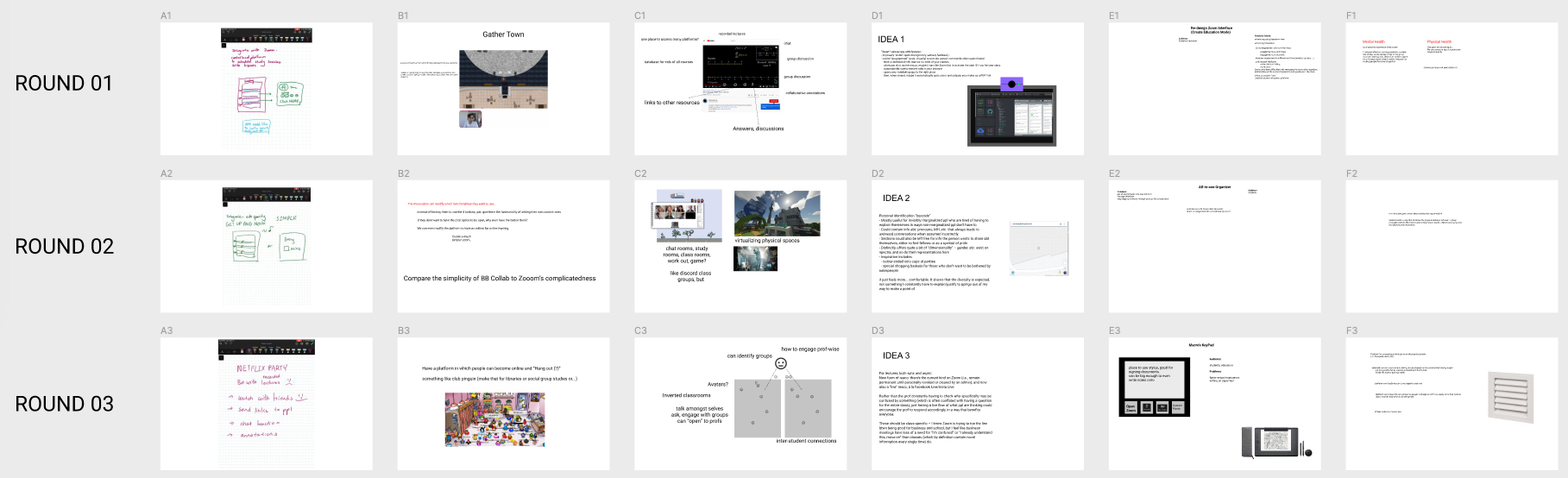
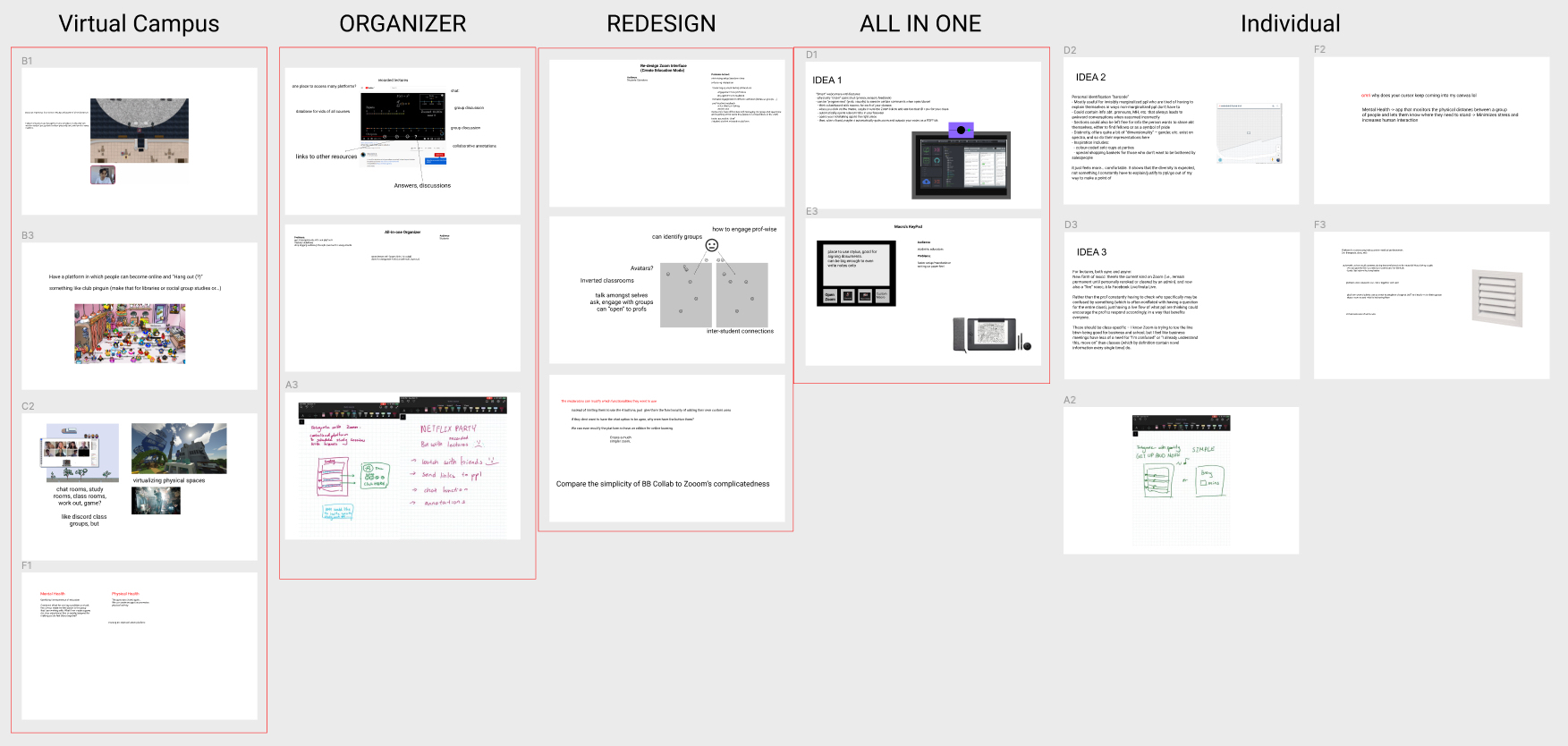
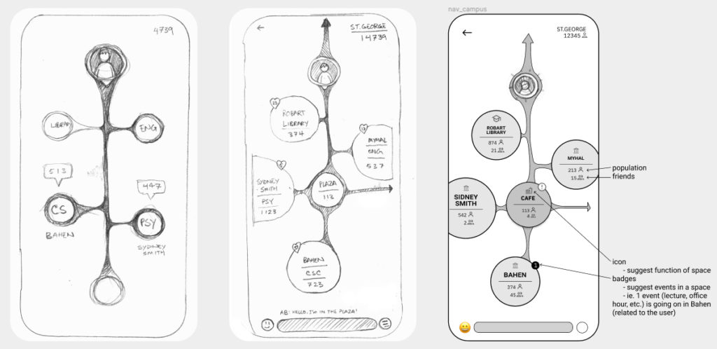
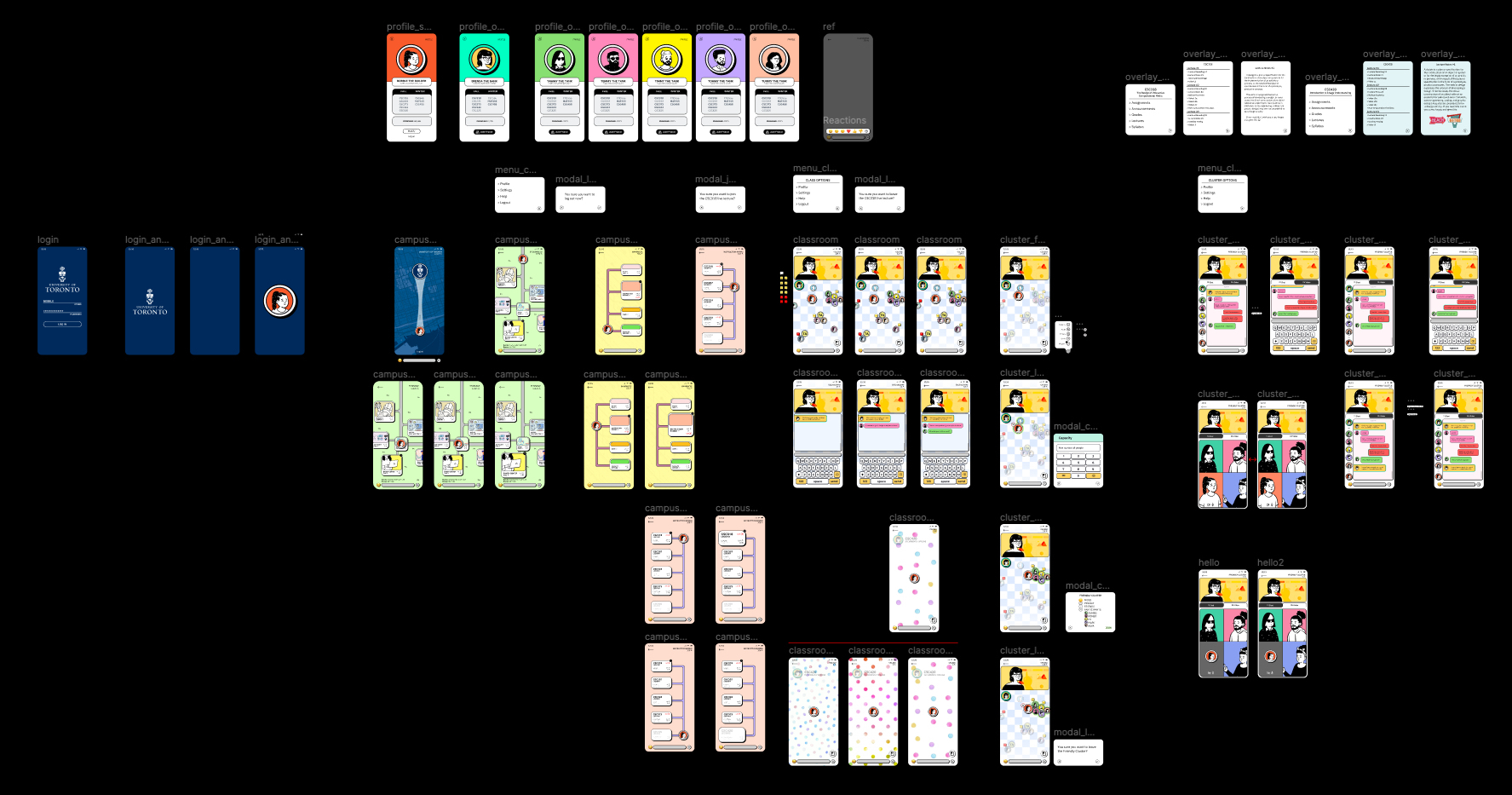
The top 5 teams were selected from around 30 teams taking part in the course competition. We were chosen among these 5 to refine further and present in the final competition. 

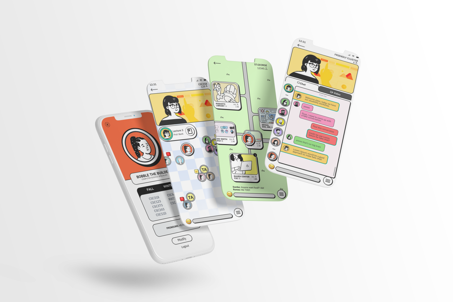
The final HiFi prototype was presented to industry experts, including UX designers from IBM.

Our team was the winner of the competition!

This course was incredibly challenging and equally rewarding – we had a great team that pulled together and brought a concept to life. From gathering data to formulating ideas to iterating over prototypes, 2X was able to maintain a smooth workflow through consistent communication and utilization of online collaborative tools. 

Despite the remote nature of the course, Zoom and Figma brought everyone together virtually with a whiteboard to flesh out ideas.

The app concept and design went through a gauntlet of tests, which truly shaped the final results. Even after the project wrapped up, ideas continued to flow and additions discussed.


An incredible term capped by a first place finish!

Back