Receptiviti
Given the existing webpage and branding material for Receptiviti, I was tasked to present a design proposal incorporating new logo design, color palettes, motion graphics, and web experience prototype.
Task
The development of a proposal for a rebranding and UI/UX design for the user onboarding flow.
-
Design
UX/UI design
-
Client
Receptiviti
-
Tools
Figma, Photoshop, Illustrator, React.JS, Typescript
The Past.
Brand Identity.
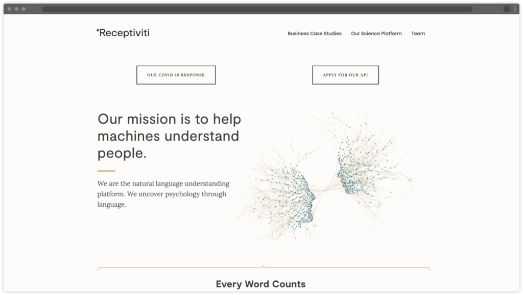
The current logo, a rotated 4-point star, had no connection to the brand – it had been purely aesthetic play from a branding exercise in the past. The wordmark was a sterile Sans Serif – tech-y but likewise nondescript. The colors used in the past were not clearly defined, but the web presence utilized a gold accents on a tan background.


Brand Identity.
The current web design utilized a generic Squarespace theme. There was no identifiable overarching design intent, and no hero imagery immediately relatable to the brand.
Design Goals.
Brand Identity.
The goal of this exercise would be twofold – develop a brand design language that would reflect the Receptiviti brand and its intentions, as well as develop a web flow that incorporated these design elements into the user experience.
Given the incredibly short development timeframe, I had to ensure that the process was streamlined and organized – I broke down the goals clearly and maintained communication with the team throughout the design process to allow for development and iteration.
I was to develop the following:
- A design language to tie together the Receptiviti brand
- A new color palette to freshen up the current muted look
- A new logo that more strongly connects to the brand
- A mock up of these design elements in a complete web prototype
Concepts Distilled.
Working with Receptiviti’s Director of Product Innovation, I developed an idea of what the team wanted the brand to represent.
Parsing through several pages of notes and ideas, I distilled the essential concepts to a simple list of notes.
- RELATABLE
- OPEN
- SIMPLE
- MINIMAL
- RECOGNIZABLE
- FLEXIBLE
- MODERN
- CLEAN
01 Branding.
The first stage of rebranding was to develop some visual concepts to inform a new aesthetic. This started with idea generation, testing with users, and refining.
The Ideas.
Before diving in to the design, I wanted to generate some conversation with the dev team on the look and feel – I did a few quick mockups around some simple ideas and presented some options for discussion
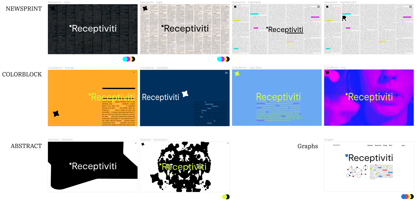
There was a clear connection with the Newsprint theme.
My intent with this concept was to bring forward the importance of text. Receptiviti’s business model revolves around the understanding of text: developing a design concept to reflect and celebrate this medium would provide a solid design base that could be carried through to any future design element.
For the Newsprint concept, there would be a few key elements: a strong columnar layout with a focus on the use of strong and clean typographical design over graphical illustrations.
The R.
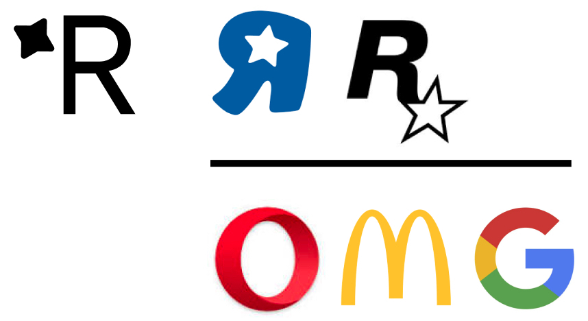
My first inclination for the logo was to simplify – something that could become recognizable . The current Receptiviti logo uses a four-pointed star. I did a little digging, but found that its origins were quite simply that someone “thought it looked cool”, or that “a logo was needed, and it looked techy”.
I decided to edit that out – not only was the R-Star combination already utilized by well known companies (Toys ‘R Us and Rockstar), but without an already established identity, I wanted to make it as simple as possible to connect with the Receptiviti brand. Immediately identifiable single letter branding (like Opera, McDonalds, or Google) would be the goal.
While brainstorming, one image that stuck in my mind was the idea of the Illuminated Manuscript – the ornate first letter that marked the page. Following with the Newsprint concept, I chose to develop the R as something distinct from the typography around it. Something that popped off the page. The R with the offset color shadow made the letter hover over the text.

Filling in the hole in the R was something I thought would add to the flexibility of the logo: with more surface area (so to speak), I could more freely play with colors, patterns, or any such ideas. This also made for a more distinctive logo, while maintaining its simplicity and readability.
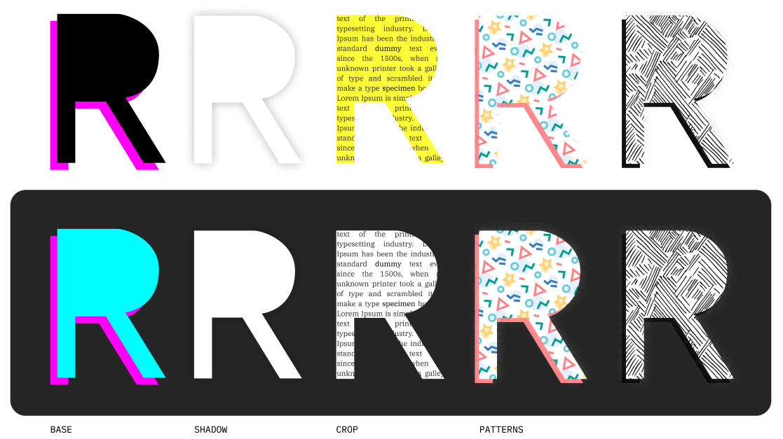
The Hero R.
I wanted to develop a concept for the hero image that reflected the function of Receptiviti. Simply put, Receptiviti’s algorithms ingests data in the form of text, applies its analysis, and provides a set of scores.
I wanted to illustrate this movement and translation through a single image.

The concept was simple enough, using the R logo as the representation of the algorithm (I called it the “filter”, though it doesn’t exactly filter), text is pushed in from the left and some type of chart is pumped out the right.
This evolved from line charts to bar charts, which more cleanly reflected the abstracted text on the left of the “filter”. I imagine this to be a motion graphic, assuming the aesthetics of vintage stereo equalizer display.

The Social.
Having developed the design concept to a reasonable state, I did a few quick and dirty mockup studies on what the branding might look like on some social media platforms.
I thought that this would be a good idea to see the ideas in use on an existing layout to see the work in context.

The Colors.
Colors are always a point of contention.
My original proposal was to adopt very basic colors to reflect the decomposition of colors, be it the primary colors or CMYK to reflect the Newsprint theme I had been developing. I considered that this would be incredibly flexible, using the black with color shifts to brightening up the branding.
The consensus was to return to a muted palette, so I did a series of studies to find a more palatable palette.

I generated a panel of color palettes, eyedropping an initial color from some precedent imagery and building out matching colors to flush out a complete model. Testing them with the Hero R image allowed for a sense of what these colors might look like in use.
I settled upon an initial palette using a dark royal blue and a tangy orange-red accent which maintained the initial brightness, though was definitely more muted. This would be the two primary colors, with a series of lighter and darker shades to be used for varieties of graphic and text.
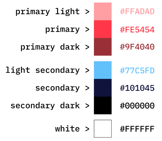

02 Experience.
The first stage of rebranding was to develop some visual concepts to inform a new aesthetic. This started with idea generation, testing with users, and refining.
The Wireframe.
Since I was also developing the bones of the onboarding and dashboard site in React and Bootstrap (as well as wiring some of the elements to the backend to communicate with our API), I already knew what general elements would be needed to be flushed out: a static front page, an Auth0 powered sign in process, a series of verification and information gathering forms, and dashboard / metrics type pages. I would also need to incorporate additional elements like alerts and menus to flush out the experience.
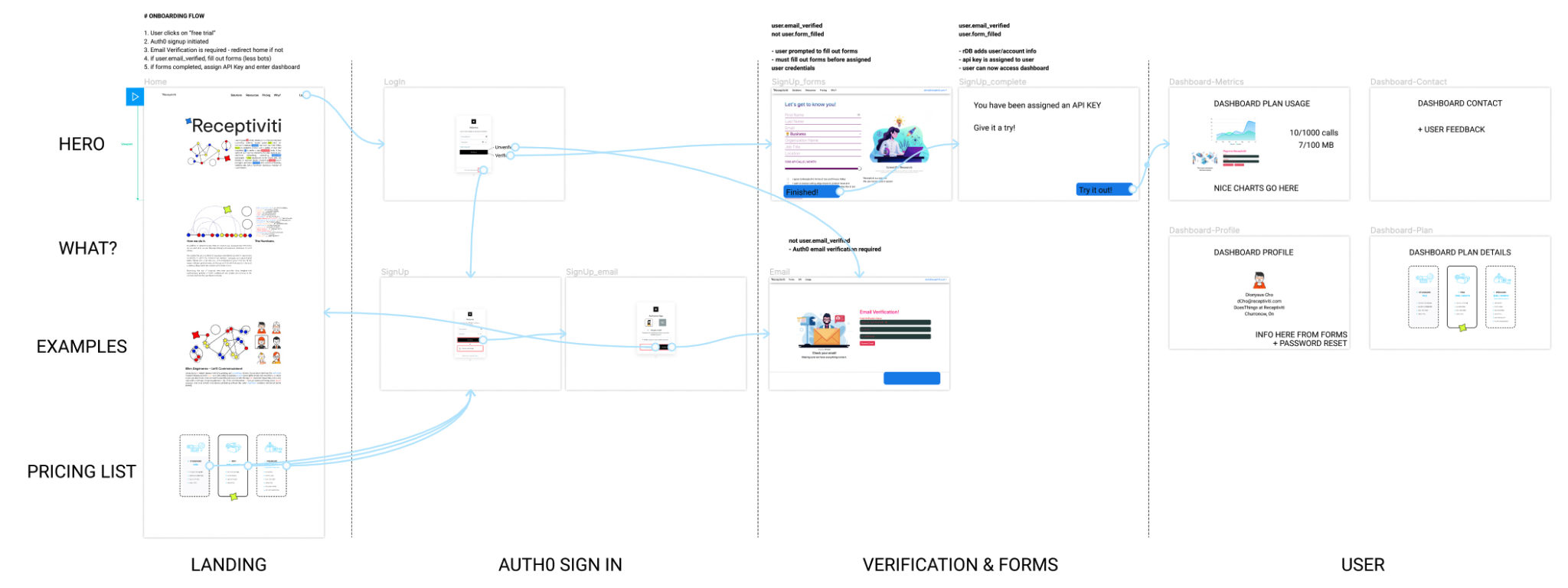
I used this rough wireframe sketch to work out the initial routing of the pages, and using it as a notepad to develop some of the elements I would need, like the states that would need to be passed into Redux.
Using Figma as a sketching tool was really handy in keeping track of development ideas, in addition to design thoughts.
The Experience.
This proposal also acts as an illustration of the usage of the branding – incorporating the Newsprint concept in conjunction with logos, typography, and colors schemes.
The design culminated in a complete mock up of all the pages and menus that would go into the onboarding process and dashboard experience.
Developed in Figma, the prototype captures the branding and colors as applied to the user experience, in an interactive platform.
This capture from the working view of the Figma prototype illustrates both the flow between screens and the extensive connection between views. This prototype view provided a reference for the development in React, providing a means of illustration the links and routing.
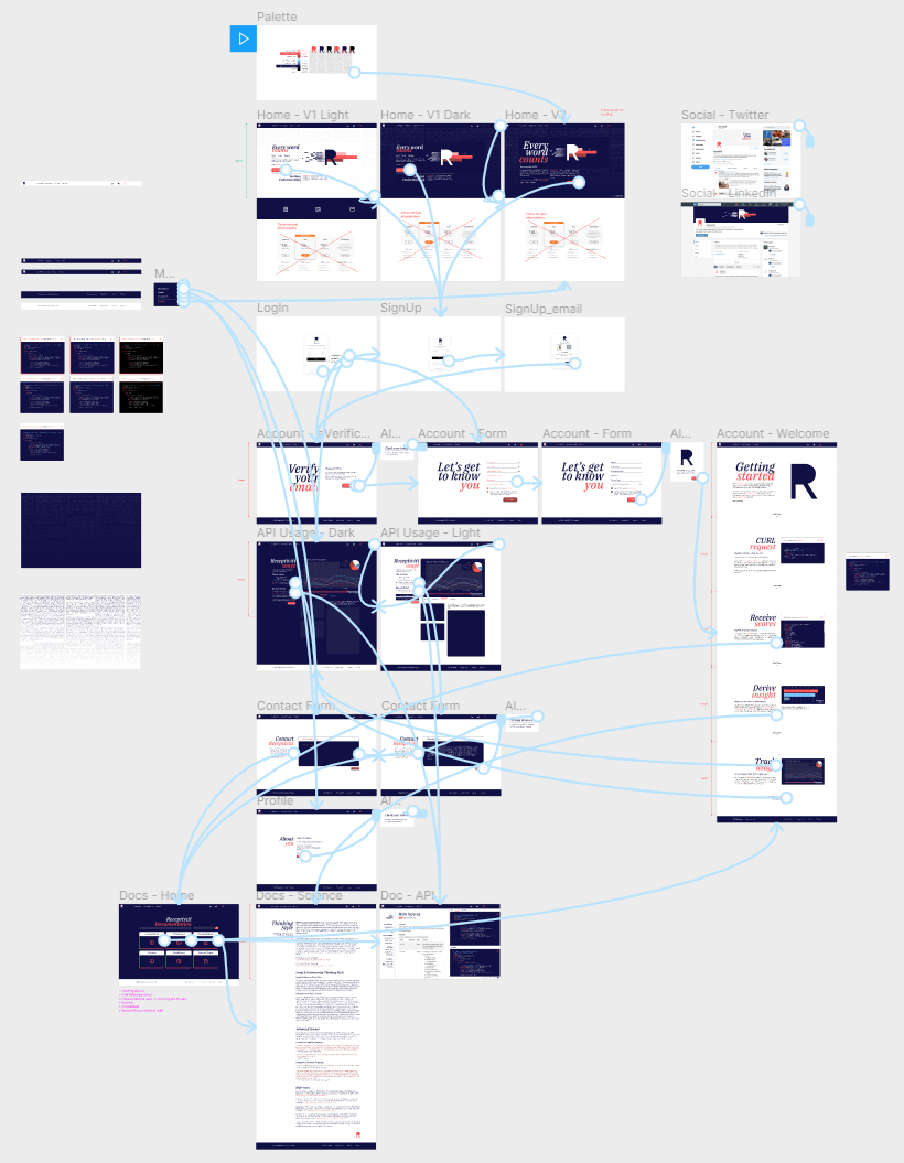
The First Impression.
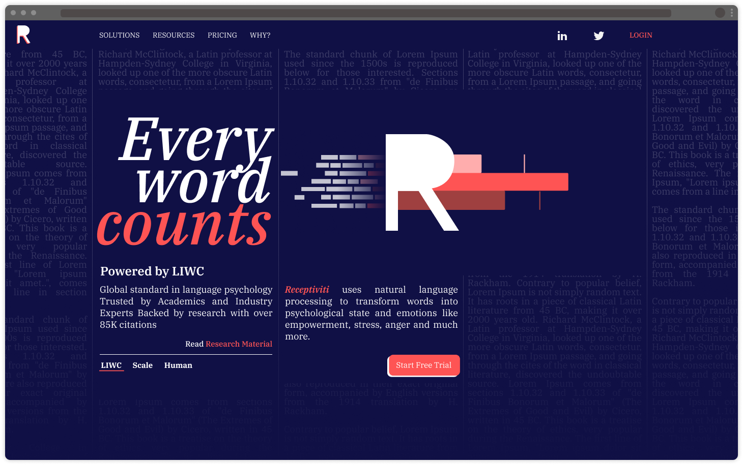
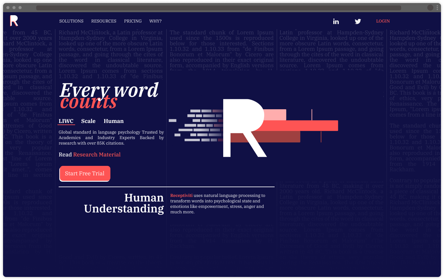
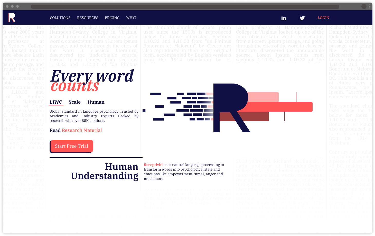
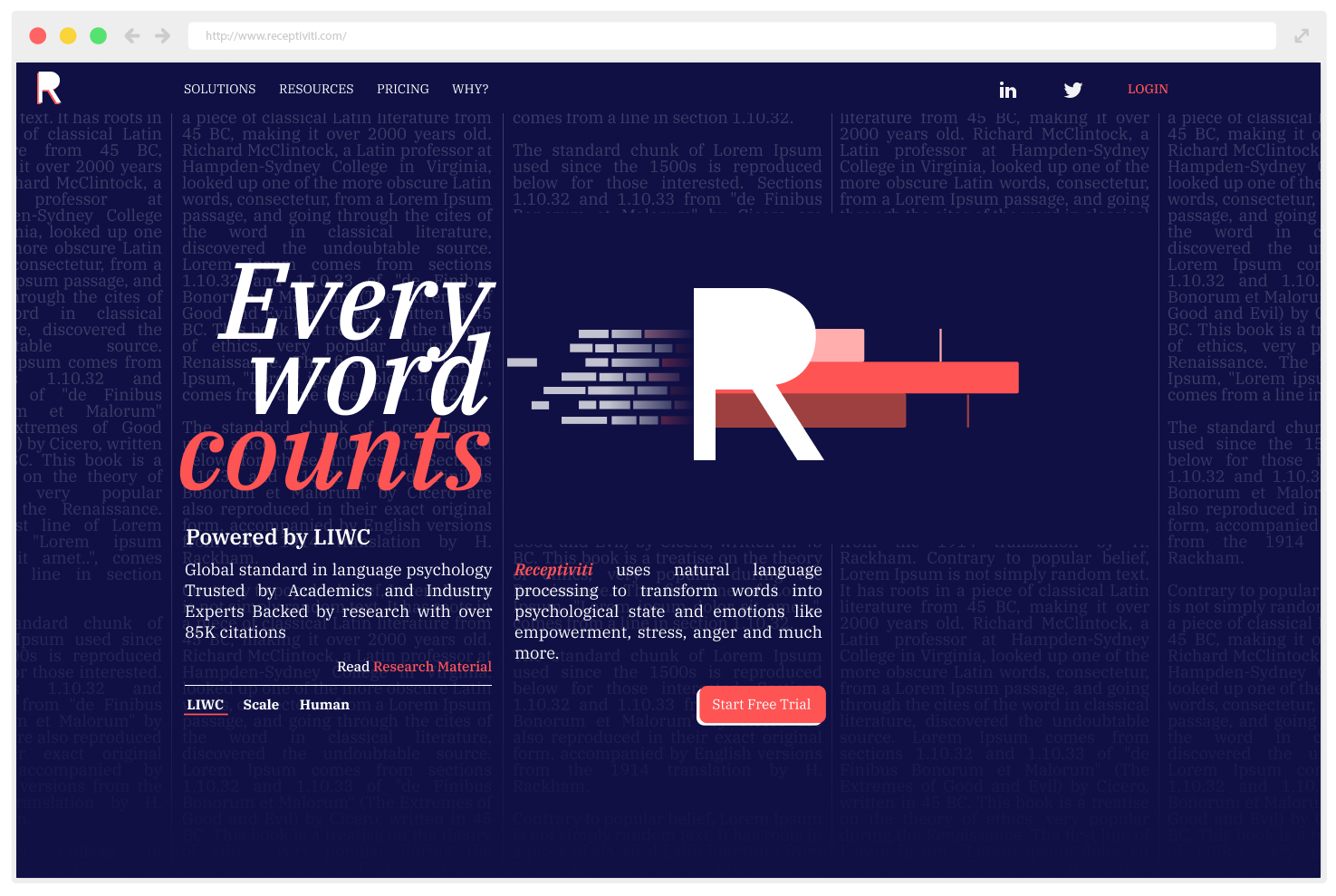
The front-page design plays off the Newsprint theme by placing graphic and textual elements within traditional newspaper grids and texts. The connection to text is important to reflect the nature of Receptiviti’s business model, so the desire is to give the user an immediate reference to this concept.
The Prototype.
Screen captures taken from the prototype illustrating the flow of the onboarding process, along with web layout, menus, alert overlays, and application of colors and styles in elements such as charts and forms.
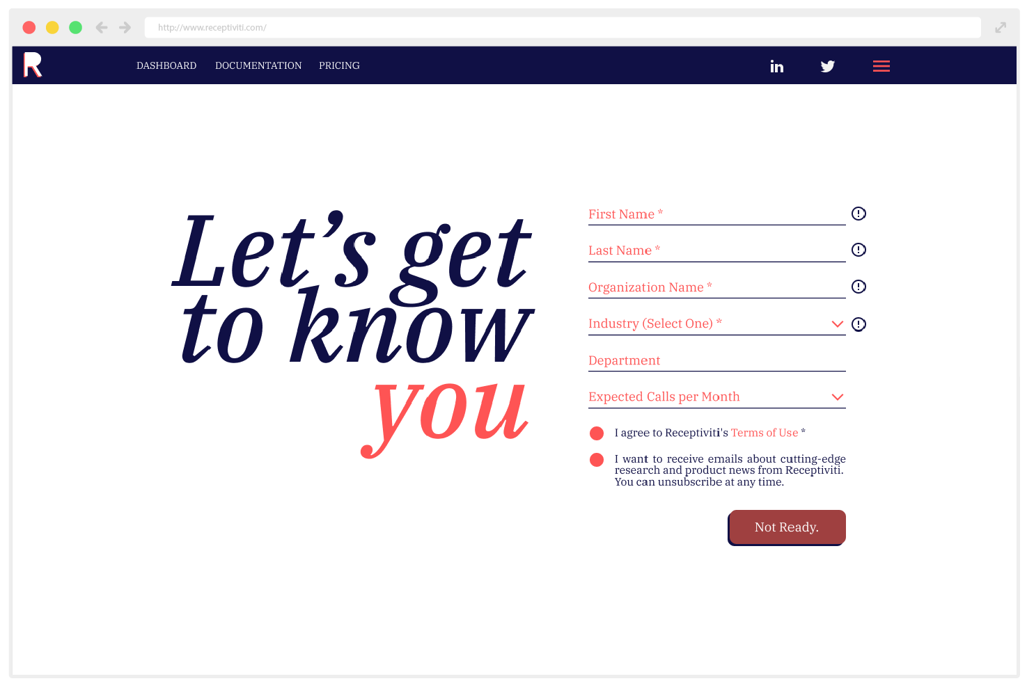
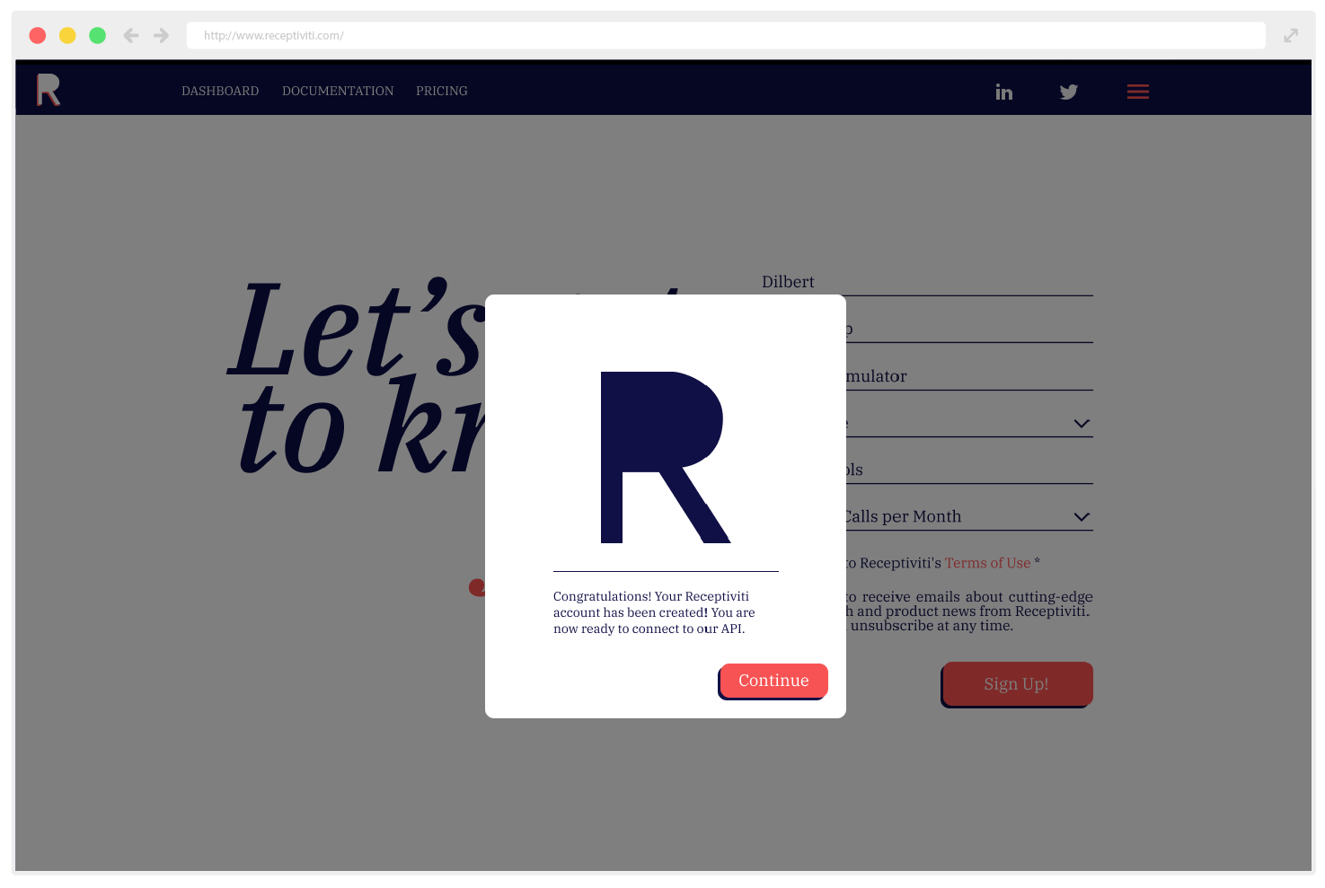
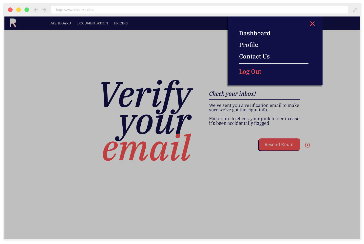
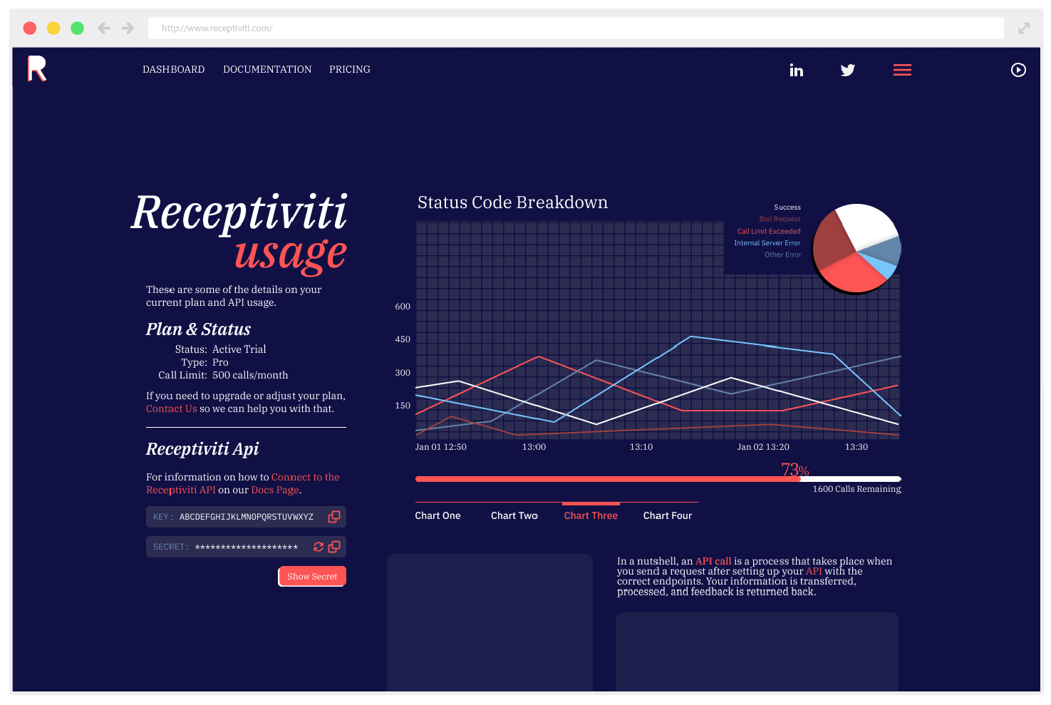
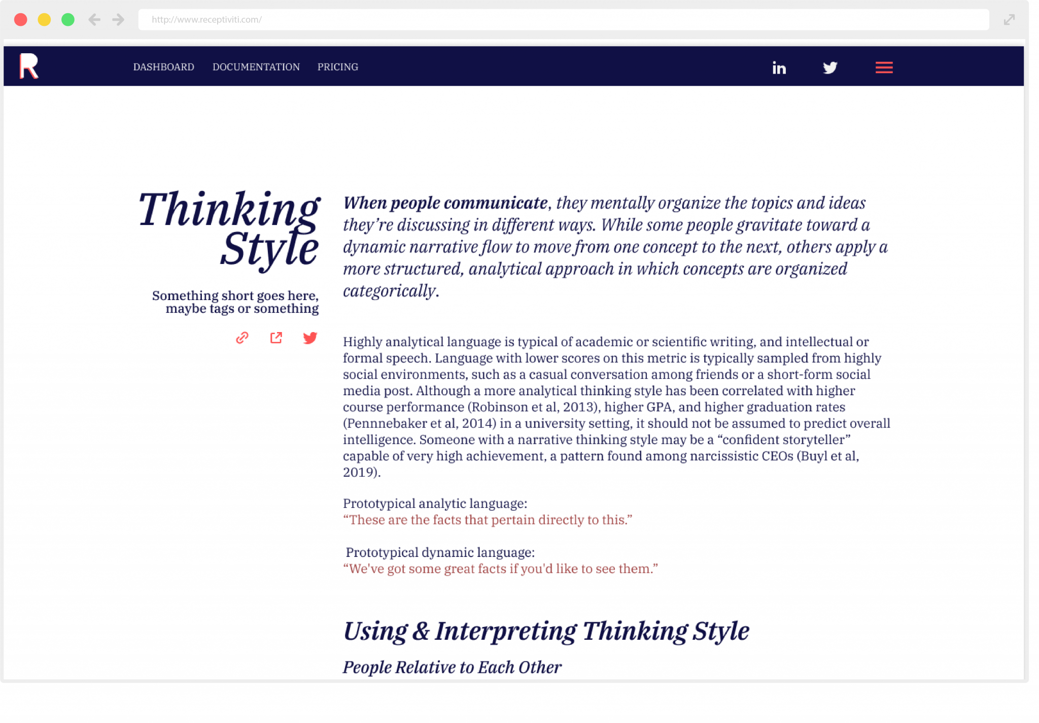
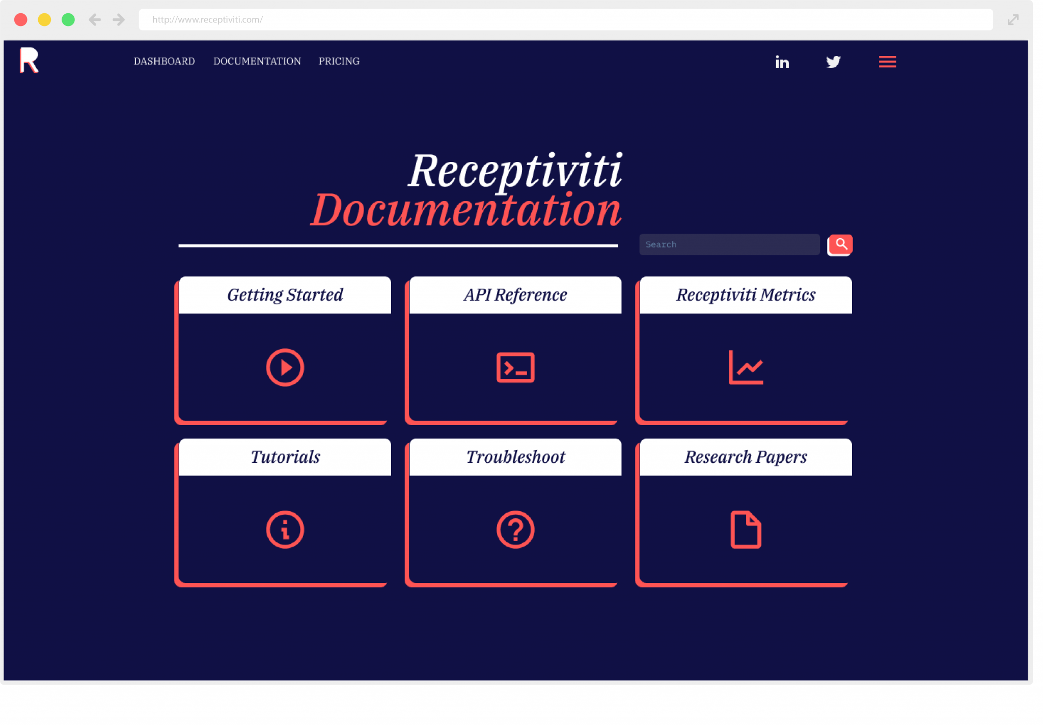
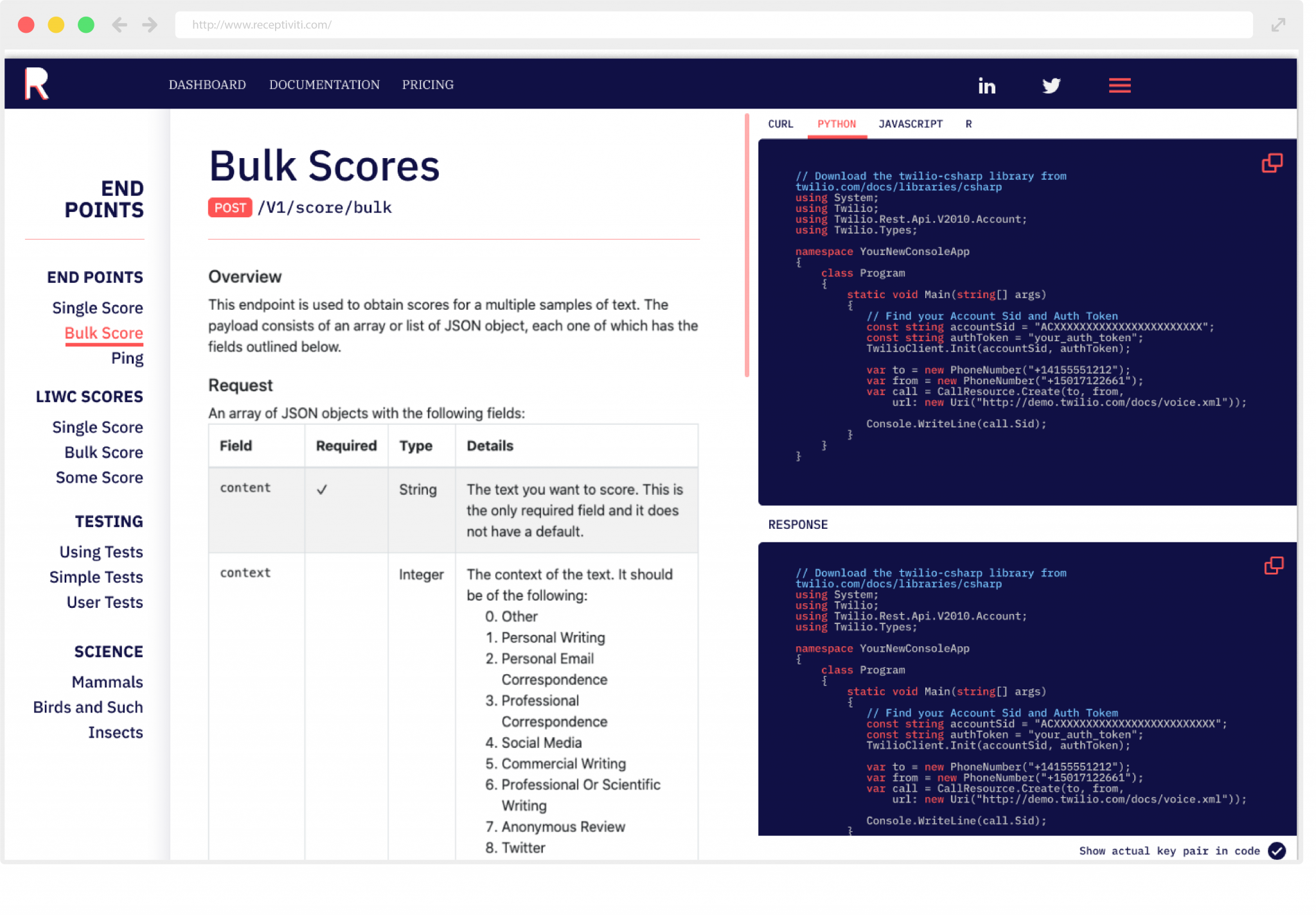
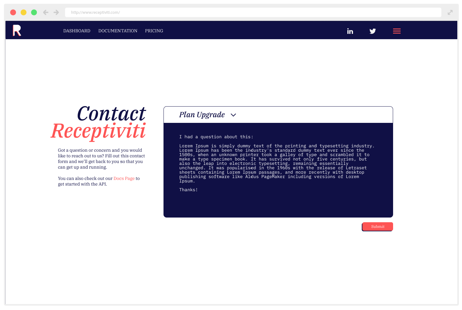
Graphs – Graphs and charts are minimal and bright – the information is clear, and the colors follow naturally from the branding.
Menu – Drop down menus are contextual depending on login / verification statuses, and reflect the dark styling of the navigation bar.
Forms – There is a focus on using text and titles that carries across views – strong messages with a focus on the last word – “You”. Form elements mimic handwritten forms, with a single underline rather than text boxes.
Modals – Pop up modals are simple and clean, providing users with concise information before guiding them on to the next page.
Code – Code snippets, provided to guide a user through the API request process, is displayed in a stylized terminal-inspired panel.
Contact – contact forms mimic dev terminals used in code snippet examples, and reflect the developer-friendly connection.
Design. Quick. Clean.
From Sketches to Prototypes.
After a whirlwind design process, I presented a complete proposal to the Receptiviti dev and leadership teams.
Utilizing interactive Figma prototyping, I walked through the design process and guided the team through the user experience.
Overall, it was an incredibly challenging experience, but provided an incredible opportunity to bring some fresh design concepts to the table.
