Reflections
Analyzing the concept of Reflections with User Interviews: utilizing a series of questions to aid a user to organize their thoughts and destress from a situation or stressor in their life when they are overwhelmed with too many or too unorganized thoughts and feelings.
Task
Utilizing interviews to test ideas for stress management.
-
Strategy
Prototyping, User Interview
-
Client
Academic - UofT
Problem.
Given TENQ, a series of questions developed as a de-stressing exercise, define a means of implementing and gathering data to judge its efficiency.
This prompt was an open project – I was provided with a simple chart of “Reflective Questions” and “Example Responses“.

Define.
The user of this TENQ process needs to destress from a situation (or stressor) in their life but is overwhelmed with too many or too unorganized thoughts and feelings.
A user might benefit from the TENQ process by having these series of questions or prompts act as a guide to help them organize their own thoughts. The TENQ does not provide solutions or suggestions in itself, merely prompts the user to think and reflect.
Ideate.
In the ideation phase, I thought about how this might be presented as an app, which would increase its accessibility to the regular user who might want to use the TENQ process. Something that felt less like taking part in a survey, but part of a more routine wellness or mindfulness routine.
Being an app would also allow for the collection of data as a means of judging the efficacy of TENQ.
Ideas included:
- Format the survey for better accessibility by providing a mobile app that a user can access at will when they feel they need to de-stress.
- Allowing for a catalog of “successful destresses”, like a journal, so that the user can remember and reflect on past experiences where they have overcome stressors.
- Instead of a user seeking the TENQ when in need (already stressed), make the use of this app part of a normal routine – eg. daily or weekly activities. This could be to reflect on past encounters (with follow up notes), or general questions to gauge user stress (maybe a daily or 2x per day notification to rate your day)
- Instead of text implementation, allow for verbal notes (rants), so that the user is not limited in their form of expression.
Prototype.
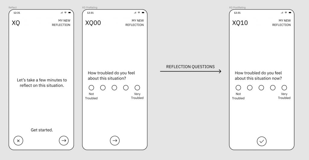
I chose to develop an interactive lofi prototype of a mobile app as a means for the user in the interviews to interact with to simulate the experience.
This was constructed in Figma as it allowed for a quick mockup of an app UI, and sharing of the prototype so that the user could navigate the app on their own screen or mobile device – limitations from interviews performed during COVID restrictions.
I used the term Reflections to replace the TENQ terminology as it provided a better sense of thought organization through self-reflection, rather than running through a gauntlet of questions in a survey.
I wanted to convey the idea of mindfulness.
New Reflections.
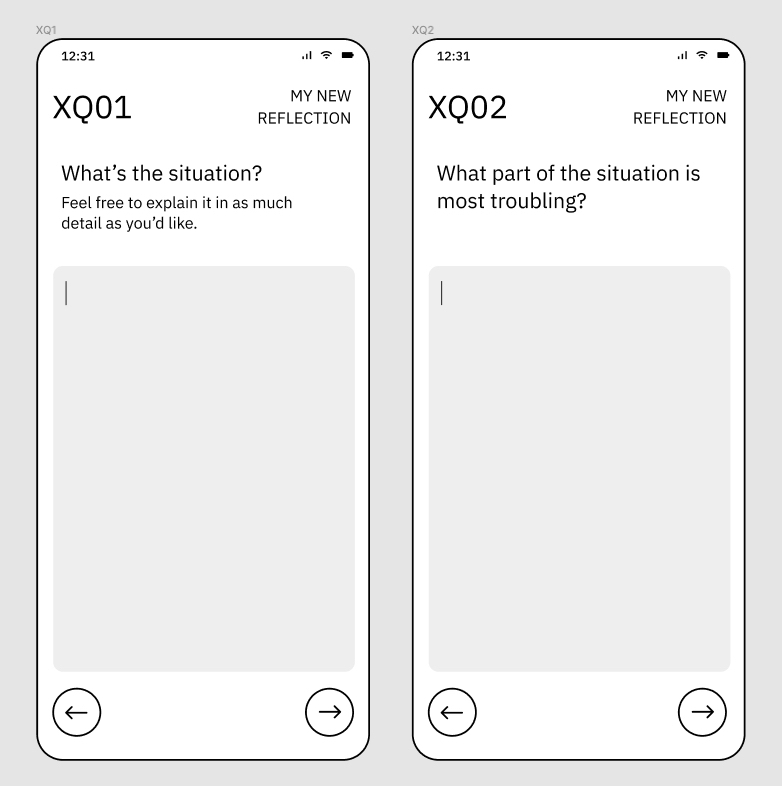
This app would incorporate the Reflection questions as a means for the user to record and organize their thoughts through a series of question prompts, similar to the given table of questions.

Where possible, these questions are broken down into more simplified prompts, so that the user does not need to type unnecessary phrases repeatedly, and to guide the user into inputting more reasonably sized responses.

For example, Q6 and Q7 have multiple input boxes, instead of the user having to answer each question within their own construction of their response. The goal is to reduce cognitive load so that the user could more readily focus on their situation and better elaborate it in their personal Reflection.

Before and after the Reflection, users are prompted to rate how troubled they are feeling. This allows for the user to judge, in some concrete manner, how effective this Reflection process was in stress management.
The user might see that before, the user was Very Troubled (5), and through a Reflection, their rating was now only Somewhat Troubled (2). This would allow the user to become better at rating their own stress levels, and have a sense at the change (here, -3), that Reflections had on the stress.
Past Reflections.
After a Reflection has been made, the user has the ability to reflect upon a past Reflection. This would, in this prototype, come as a notification prompting the user to take some time to reflect.

The idea would be for the user to return to a past Reflection so that they could re-process a situation, now with further hindsight. I used the sample responses provided in the project brief to fill out this past Reflection.

Being farther removed from the stressor, and having already created a Reflection for it, they could go over their past thoughts, and provided the opportunity to rate their current feelings about the situation. Also, they can document what new feelings they have on the subject.
The idea of reflecting on a past Reflection is that, like the process of creating the original Reflection, the user has organized their thoughts, and having time to reconsider them, provide even further self-analysis. This would provide for the user at least 3 quantitative points (ratings for pre, post, and past) to assess the situation. This would also allow the user to process and learn from their own experiences having either overcome, or continue to deal with their stressor.
Having a catalog of past Reflections they can reflect upon will also allow them to more easily assess their future stressors – they can better judge how troubling a stressor might be given the experiences they have already processed.
Daily Ratings.
A novel addition I included was the introduction of a “Daily Rating” that could act as a means for the user to stay connected with the app when they are not having stressful moments. The idea is that this would allow the user to rate their current feelings with a simple score, taken twice daily.

With the simple scale of ☹️ 😐 😀 , the user can quickly input their Rating without deep introspection. This could be triggered by a notification (left), the use of a home page widget (center) and a dedicated Ratings page within the app (right).
The idea is that these Ratings would provide a simple quantitative graphic by which they can visualize their mood over time. In the Ratings app view, this infographic would give some sort of chart that the user could reflect upon their past Ratings. This could help place Reflections in time.

Secondly, a negative ☹️ rating could trigger a prompt for the user to start a Reflection. This acts to connect negative emotions or stressors to a possible means of alleviating them – the Reflection process.
Overall, the intent is that the user becomes more aware of their current feelings through Daily Ratings and more regularly interacting with the app so that when they are stressed, they are more comfortable with working through a Reflection.
User Interview and Testing.
Preparation.
For this section, I chose to incorporate user testing of the prototype (more UX elements) and the user interview as one combined session so that I could ask questions about the user experience of the prototype as well as their thoughts on the Reflection process. This was done so that the user would not have prior experience or exposure to the TENQ – the tasks asked of them and their interview responses would be “fresh” and unbiased.
I made a preliminary interview guide with a semi-structured approach. The questions, of course, were created to work through the user experience and Reflection process.
The order of the interview was constructed as such:
- Introduction
- consent and overview
- High-Level
- see if user has experience with destressing apps
- Past Reflections
- to get user familiar with TENQ structure
- New Reflection
- undergo the TENQ process on a stressor
- Daily Rating
- test the idea of interactive ☹️ 😐 😀 ratings with the user
- Obstacles
- Conclusion
Interview.
The interview was quite stress-free and fun. I had a friendly conversation with the user (I will use the name Lee, the generic name of the persona I used in the prototype), and first set up the interview by opening the Figma prototype in a browser, alongside a Google text document to record their text inputs. The conversation and test were recorded via screen recording of Lee’s screen, along with audio from Lee and myself.
The interview provided a lot of insight on both the user experience of the app prototype and on the TENQ process itself.
As Lee had no prior experience with TENQ, working through the Reflection with a real stressor allowed them to really process the situation themselves in a very meaningful manner, ending the Reflection with the statement that they felt like “I am my own therapist”, and that it allowed them to “break down the problem through the questions” and, in a catchy summary: “digest your stress”.
Seeing how Lee’s Reflection reduced their Troubling rating of the situation from a pre-Reflection rating of 3 to a post-Reflection rating of 2 suggested that the process was effective – their comments after this stage confirmed this, showing positivity towards the ability to “reevaluate my own worries in different ways”, which they had not done previously.
On the series of questions, which were taken directly from the given list, Lee suggested that prompts to summarize (Q7) or reconsider (Q8) felt very empowering, as it “cuts down the fat” of unnecessary thoughts from the situation.
However, the process at times felt repetitive (Q1 and Q2), or uncomfortable to think about (Q4), or difficult to answer (Q6), especially “if the source of the stress is more complicated or unknown”.
While Lee felt that the Reflection was overall effective in the goal of organizing their thoughts towards a stressor and reducing stress, they felt that the process was too long – in a normal situation, they felt they might be too lazy to type so much, and might opt to avoid introspection.
The inclusion of the “extra” app elements, the prompt to reflect on past Reflections and to perform Daily Ratings, was well received.
Lee felt that past Reflections would be effective as they would be removed from the “heat” of the situation, and be able to process the Reflection with less emotions.
The Daily Ratings was considered positive as it was simple and easy to accomplish, with the use of a widget being unobtrusive. The triggering of a new Reflection upon a ☹️ rating gave them a nudge or opportunity to say more when they were not in a great mood: “make me talk it out with a rant”.

Analysis.
The initial prototype was well generally well received, but the Usability Test and Interview brought up several issues and improvements that could be made to improve upon for the next iteration. I selected some of the more provocative ideas.
Text Input.
One idea that I had suggested in the Ideate portion (text vs audio input), was actually suggested by Lee before I had the opportunity to bring it up. Lee had stated that the Reflection process was too text-heavy and that they felt they did not like to type so much. Given that this was presented as a mobile app, Lee suggested that allowing for audio recordings would make it much more accessible – “think less, say more”. This is definitely something that should be considered given the nature of the device and user familiarity and comfort with self recording. The ease to speak and transcribe (ie. as in apps like Otter.ai) would simplify the reflection.

I originally thought that I might ask if this would be a good means of input because I had some hesitation with whether this would be effective: would ranting be as effective? Yes, the ability to record would allow for quicker input, but the act of transcribing into text would allow for the user to reflect while they are putting thought to word.
However, Lee brought up two things: ease of use would promote their likelihood of app usage, and reflecting on past Reflections would be less “serious” if they could listen to their own voice. Having less of a barrier to create Reflections would definitely be an improvement, but to ensure that the effectiveness of this remains the same would need to be considered through further testing.
Prompts.
In the Prototype design, I had already felt that there might be too much cognitive load in the stream of questions, and I tried to account for this by breaking up questions into shorter text prompts.
Lee suggested that while this was effective in helping prompt input, it was still quite tedious to remember what had been asked, and often felt like they were answering the same questions repeatedly.
For example, without knowing Q2, Lee filled out Q1 quite thoroughly (as prompted). However, much of it was overlapping their intended response to the following Q2 – they felt this was annoying and they had to figure out extra stuff for a new response.
This could be solved by either adjusting the question set, or making the flow of questions (UX) a little more friendly. While the experienced user might already know the sequence of questions, new or infrequent users might not and become frustrated with this situation (ironic, since this is supposed to be de-stressing). Therefore, one possibility could be to allow for some way to better view the flow of questions, so that the user knows what has been asked or what will be asked more simply.


Lee also appreciated the prompts (eg. Q7) being broken down into easy to fill out bits. This simplified the mental process.
However, Lee suggested that the Reflections in its current state would be too monotonous a process. While effective in organizing thought, Lee felt that it was difficult to concretize the prompts into words by supplying only a text box to fill.
During the Reflection, Lee would have to sit in silence thinking before entering text. Lee suggested additional prompts to guide thoughts and emotions – perhaps images or text options (ie. to represent emotions or feelings towards a situation) to spark the train of thought.
This would be an incredible opportunity, given the device format, to incorporate media into both responses and questions. Perhaps this would also make this more accessible for different audiences and age groups.
